The human brain’s perception and interpretation of color is a complex physiopsychological process that is not fully understood. However, the physical nature of color can be described scientifically, supported by both experimental findings and theoretical principles. Sir Isaac Newton, in 1666, discovered that when sunlight passes through a glass prism, it separates into a continuous spectrum of colors. This spectrum, ranging from violet to red, shows no distinct boundaries between colors but rather a smooth transition from one to the next. These colors, categorized broadly into six regions—violet, blue, green, yellow, orange, and red—form the foundation of our understanding of visible light and color.
The colors perceived by humans and other animals are determined by the light reflected from objects. Visible light is a narrow band within the electromagnetic spectrum, and objects appear colored because they reflect certain wavelengths of light while absorbing others. For example, green objects reflect light primarily in the 500 to 570 nm range, giving them their distinctive hue. When all visible wavelengths are reflected equally, the object appears white. In contrast, when reflectance is uneven, the object takes on a specific color based on the dominant wavelength reflected.
The study of light is integral to the science of color. Achromatic light, which lacks color, is characterized solely by its intensity and is seen in grayscale images, such as those on black-and-white television screens. Chromatic light, on the other hand, spans the electromagnetic spectrum from approximately 400 to 700 nm and is described using three main quantities: radiance, luminance, and brightness. Radiance refers to the total energy emitted from a light source, luminance describes the perceived brightness of that light by an observer, and brightness itself is a subjective measure, making it difficult to quantify.
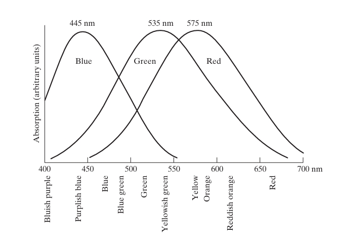
Human color vision is enabled by cones in the eye, which are sensitive to different wavelengths of light. There are approximately 6 to 7 million cones in the human eye, divided into three types that correspond to the primary colors: red, green, and blue. These cones, however, do not perceive these colors equally—about 65% are sensitive to red light, 33% to green, and only 2% to blue, though blue cones are the most sensitive. Based on these findings, the CIE (Commission Internationale de l’Eclairage) established a standardized color model in 1931, assigning specific wavelengths to blue (435.8 nm), green (546.1 nm), and red (700 nm). While these standards provide a reference for color representation, they do not perfectly match the experimental absorption curves of human vision, illustrating that no single wavelength can fully represent the complex experience of color perception.

Despite the use of red, green, and blue as “primary” colors for standardization, it is important to note that mixing these three fixed wavelengths does not produce all visible colors. The complexity of human color perception goes beyond this simplified model, as other factors, such as varying wavelengths and intensity proportions, contribute to the wide array of colors that we experience in the natural world.

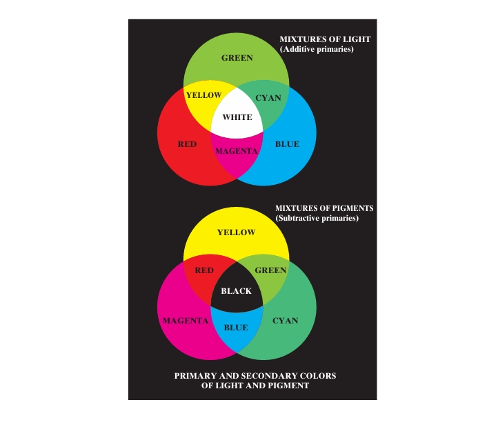
Differentiating between the primary colors of light and the primary colors of pigments is crucial for understanding color theory. In the context of pigments, the primary colors are magenta, cyan, and yellow, which subtract or absorb a primary color of light and reflect or transmit the other two. This results in the secondary colors of pigments being red, green, and blue. When these pigment primaries are combined in various proportions, or when a secondary color is paired with its opposite primary, the result is black. This principle is the foundation of subtractive color mixing, which applies to printing and painting.
In contrast, light colors follow the additive color model, such as in color television reception. In older CRT (cathode ray tube) televisions, tiny phosphor dots on the screen emit red, green, or blue light when excited by electron guns. By modulating the intensity of these dots, the red, green, and blue light is combined in the viewer’s eyes to create a full-color image. This process, repeated 30 times per second, creates the illusion of continuous motion. Modern digital displays, like LCD and plasma screens, also use red, green, and blue subpixels to create color. In these displays, polarized light filters and gas cells coated with phosphor produce the primary colors, generating a color image by addressing individual pixel coordinates.
The three characteristics that distinguish colors are brightness, hue, and saturation. Brightness refers to the intensity of light, while hue describes the dominant wavelength, determining whether we perceive a color as red, blue, or green. Saturation, on the other hand, measures the purity of the color, with fully saturated colors containing no white light, and less saturated colors, such as pink or lavender, having a significant amount of white light mixed in. Together, hue and saturation are referred to as chromaticity, a key factor in how we perceive and differentiate colors.
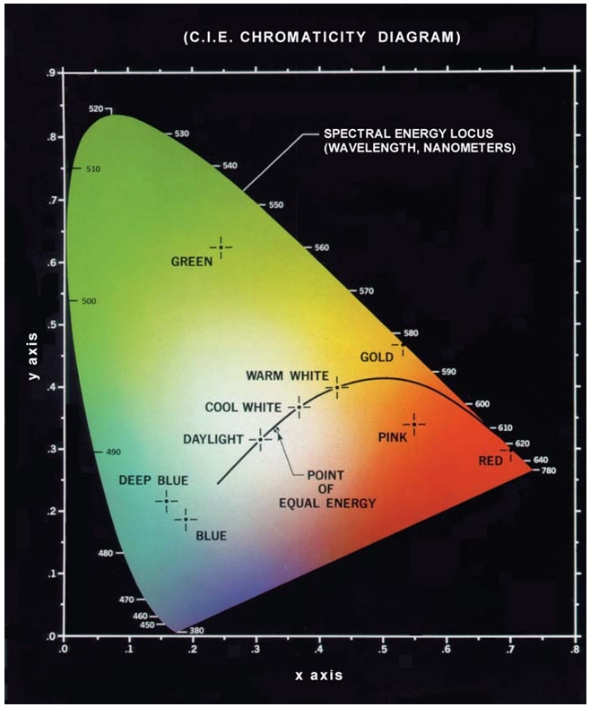
The tristimulus values (X, Y, Z) mathematically describe the amounts of red, green, and blue needed to form a specific color. These values are essential in color representation and can be derived from color-matching functions, which are experimentally determined functions that measure how much of each primary light is needed to match a given color. The tristimulus values are combined to form the trichromatic coefficients, denoted by x, y, and z, where:
Since , knowing two of the coefficients allows calculation of the third. These coefficients are plotted on the CIE chromaticity diagram, a mathematical model that visualizes color composition as a function of red (x) and green (y), with blue (z) calculated from . Each point on the diagram represents a specific color, with points on the boundary corresponding to fully saturated spectral colors.

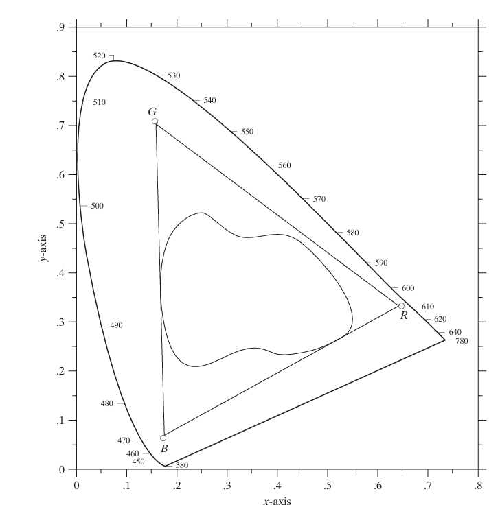
The chromaticity diagram is particularly useful for color mixing. By connecting two points on the diagram with a straight line, one can determine the range of colors that can be obtained by combining these two colors. Extending this concept to three colors forms a triangle, representing all the colors that can be produced by mixing those three colors. However, it is important to note that no triangle can cover the entire color spectrum, demonstrating the limitation of using three fixed primaries to reproduce all visible colors. This limitation is evident when comparing the color gamuts of RGB monitors and high-quality color printers. While RGB monitors rely on additive color mixing, printers use a combination of additive and subtractive methods, resulting in a more irregular color gamut that is harder to control.

More details about color fundamentals?
1. Nature of Color: Light and Wavelengths
At its core, color is the result of the interaction between light and matter. Visible light is electromagnetic radiation with wavelengths ranging from approximately 380 nm to 750 nm. Different wavelengths correspond to different colors:
- Short wavelengths (~380-450 nm) correspond to violet/blue.
- Medium wavelengths (~500-550 nm) correspond to green.
- Long wavelengths (~600-750 nm) correspond to red.
When light hits an object, the object absorbs certain wavelengths and reflects others, which determines the color we perceive. For example, a red apple reflects long wavelengths in the red spectrum.
Mathematical Example:
The energy of light can be described by the equation:
Where:
- is the energy of the photon,
- is Planck’s constant (),
- is the speed of light (),
- is the wavelength in meters.
For example, for red light with a wavelength of :
2. Additive and Subtractive Color Models
Additive Color Model (RGB)
This model is used for screens and electronic displays. It involves three primary colors—Red, Green, and Blue—being combined to produce other colors. The more light that is added, the brighter the resulting color becomes, with the combination of all three primary colors yielding white.
Mathematically, the RGB color model can be represented as:
Where:
- , , and are values from 0 to 255 representing the intensity of red, green, and blue components, respectively.
For instance, to create yellow, you combine red and green light:
Subtractive Color Model (CMY/CMYK)
This model is used for pigments and printing. The primary colors are Cyan, Magenta, and Yellow. These colors are subtractive because they absorb (subtract) light. Black (K) is added in the CMYK model to produce deeper shades.
The mathematical conversion between RGB and CMY is:
Where , , and are normalized values (0 to 1), and , , and represent cyan, magenta, and yellow.
3. Color Spaces and Color Perception
RGB Color Space
The RGB color space defines a 3D cube where each axis represents the intensity of the red, green, and blue components. This color space is used in many digital displays and cameras.
CIE XYZ Color Space
The CIE XYZ color space, developed in 1931 by the International Commission on Illumination (CIE), is a perceptually uniform color space. It’s based on human vision, and the Y component corresponds to the brightness (luminance), while X and Z correspond to chromaticity.
The transformation from RGB to CIE XYZ is often achieved using a linear matrix transformation:
Where , , and are normalized RGB values.
CIE LAB Color Space
CIE LAB is another perceptually uniform color space that consists of:
- L: Luminance (lightness),
- a: Green to Red axis,
- b: Blue to Yellow axis.
The transformation from XYZ to LAB is nonlinear and involves several steps to account for the nonlinear perception of light by human vision.
4. Color Mixing and Complementary Colors
Color Wheel
The color wheel represents the relationship between colors, with primary, secondary, and tertiary colors placed in a circle. Complementary colors are pairs of colors that, when combined, cancel each other out (e.g., red and green, blue and orange). These pairs of colors, when added, produce white or black (depending on the model).
Color Addition Formula
For complementary colors in the additive model:
For instance, if red () is combined with cyan ():
This results in white light.
5. Color Perception and Human Vision
Human vision perceives color via photoreceptor cells called cones, which are sensitive to different wavelength ranges. There are three types of cones, corresponding roughly to the red, green, and blue regions of the spectrum, which aligns with the trichromatic theory of color vision. The perceived color is the brain’s interpretation of the relative stimulation of these cones.
Mathematical Model: CIE Color Matching Functions
The CIE 1931 color matching functions () provide a mathematical framework for predicting color perception based on the spectral distribution of light. The perceived color can be expressed as a weighted sum of these functions over the visible spectrum:
Where is the spectral power distribution of the light.
6. Color Temperature
Color temperature describes the color of light emitted by an ideal black body radiator at a given temperature, measured in Kelvin (K). It ranges from warm (reddish) colors to cool (bluish) colors. Mathematically, this can be modeled using Planck’s Law for blackbody radiation, although simplified approximations are often used in everyday color temperature calculations.
- Warm light (below 3500K): Red-yellow hues.
- Neutral light (3500K-5000K): White.
- Cool light (above 5000K): Blue hues.
References:
- Halliday, D., Resnick, R., & Walker, J. (2010). Fundamentals of Physics. John Wiley & Sons.
- Smith, T., & Guild, J. (1931). The CIE 1931 color-matching functions. Transactions of the Optical Society, 33(3), 73.
- Fairchild, M. D. (2013). Color Appearance Models (3rd ed.). John Wiley & Sons.
